Marketing Photographs
Marketing Photographs Not for the Timid
Is it Quantity or Quality which should prevail? One one hand the quality is essential, but one must have a sufficient quantity in order to engage the largest audience. Quantity doesn’t mean you as the photographer don’t need to maintain your level of quality. You can have both. The trouble is when you have a high number of images in your online collection the audience must scroll through many pages of pictures and the ones “below the fold” may never be seen.
Putting the images in some topically random order assures the audience doesn’t come to think the you only do photographs of one thing. Too many pictures of your cat or dog, or lots of pictures of different cats and dogs may interest the pet lovers, but it will turn off the landscape and architecture audience.
Recently I subscribed to the ClickASnap.com platform to facilitate my collections. They provide a token View Fee for when someone clicks on and views an image for 5 seconds or longer. This fee is derived from their paid subscriptions not from the person viewing the images. The second value they provide is printing and shipping of products which include the images their subscribers post.
It is the responsibility of the photographer to develop the customer=base for the products. This is why I have written this Medium article and you are reading it. I want you to see my photography and possibly buy a print of one type or another.

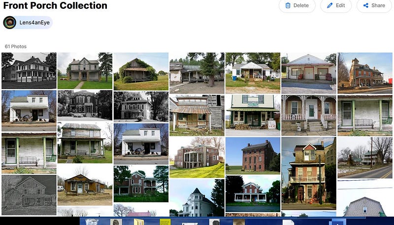
The Front Porch Collection is an ongoing project where I attempt to present a wide variety of examples from mere stoops to wraparound verandas. Some houses are abandoned and dilapidated while others remain occupied (even if dilapidated). Still others are well maintained and grand.

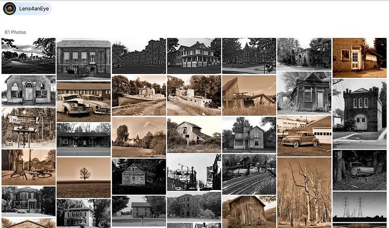
The Black and White Collection is another niche album for the aficionados of the monochrome presentation style. B&W is not favored by everyone so if B&W is what one wants to see, clicking on the specific link saves a lot of time. As the photographer I would rather the audience look at everything, but that is not realistic in this fast paced world.
With 14 topical album from which to choose one needs a shortcut to get to the list of albums. Viola! Click Here to see the album list.
Trying to get attention in the world of millions of photographers and billions of images is not for the faint of heart. All one can do is keep the effort going.